Take a photo of a barcode or cover
3.92 AVERAGE
3.92 AVERAGE

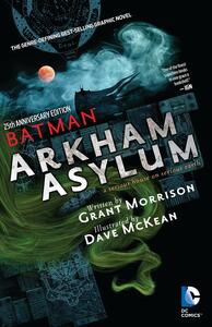
an absolute gothic masterpiece. so many elements to love. the twisty, turny art style. batsy’s long ears. the joker’s pure feral nature. his pet names for batman; ‘sweetheart’ and ‘darling’. the haunting of arkham and its blood soaked walls. pure perfection!
challenging
dark
tense
fast-paced
Plot or Character Driven:
A mix
Strong character development:
Complicated
Flaws of characters a main focus:
Yes
"Sometimes...sometimes I think the Asylum is a head. We're inside a huge head that dreams us all into being. Perhaps it's in your head, Batman. Arkham is a looking glass and we are you." - The Mad Hatter
I for one loved the art even though it seems that this graphic novel is heavily criticised for it. Especially, the way Morrison depicted The Joker. I did knock a star off for the typography as I found it a challenge to read at times but all in all a very dark enjoyable read.
I for one loved the art even though it seems that this graphic novel is heavily criticised for it. Especially, the way Morrison depicted The Joker. I did knock a star off for the typography as I found it a challenge to read at times but all in all a very dark enjoyable read.
A very stylish impressionists graphic novel. Batman is more of an excuse for the story than a character in this. But beautiful to look at suitably Gothic and drear.

3.5 stars
Even though the book was >200 pages, the actual story was < 50. What we get in that is classic Joker test of Batman and a lot of backstory on the Arkhams. Pretty good.
However, the art style consists of mostly semi photo-realistic images in tall, thin panels and we never get a clear view of Batman. He's just shown in shadows and in the background. He also fights just one enemy and the story ends abruptly. The authors were more interested in putting an idea out there than telling a complete story.

The Batman is trapped in the loony bin with Joker hosting the party. Joker's dialog made the story so entertaining. Reminded me stylistically of Sandman.
This seems to be a book that people either love or hate. Somehow I've managed to only read it now, over 30 years after it was published, and my first reaction was, it's ok. In particular, I've never been a big fan of McKean's impressionistic art style and much of this is hard to see and understand because of its abstract nature. Then I read the original script and notes by Morrison (while flipping back through the actual story) included in this 25th anniversary edition. Much of the subtext and allegorical nature had gone over my head, but once I understood what Morrison was doing, it became more enjoyable. There were also pieces of overt text and art that his notes made clearer. So basically, I read this three times and now understand and appreciate it better. I'm still not a big fan of McKean's artwork (as sequential art; as fine art it's excellent), but now I understand why Batman is just a blurry shadow and why certain layouts were used. The bottom line is that this is a dark exploration of Batman's psychology, showing how he could overcome his demons and become more whole.

dark
fast-paced
Plot or Character Driven:
N/A
Strong character development:
No
Loveable characters:
No
Diverse cast of characters:
Complicated
Flaws of characters a main focus:
Complicated

See reading progress notes. The addenda were interesting but ultimately didn't change my opinion of the book.

dark
Plot or Character Driven:
A mix
Strong character development:
No
Loveable characters:
No
Diverse cast of characters:
No
Flaws of characters a main focus:
Yes