Take a photo of a barcode or cover
I did not enjoy this at all, and I love Jean Grey. Essentially we get 3 “What If?” stories about changing various moments in her life. Unfortunately all of them are varying degrees of feeling completely off base for the character while also being rushed and underdeveloped. In trying to make one choice right, it’s almost like Jean goes to the exact opposite end of the spectrum to actively make things worse in the long run. It’s eventually revealed to be a plot device that this keeps happening, but it doesn’t make for an enjoyable read.
Unfortunately, I was really hoping to get more of a bridge between Jean’s death at the Hellfire Gala and her reappearance in Immortal X-Men, but this doesn’t add any depth to that story. It all basically boils down to telling Jean to trust her instincts, but given how that went after making one change in each scenario, I don’t really trust her instincts at all.
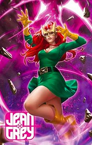
Bernard Chang’s art is fine. It has good and bad moments. Unfortunately, I really dislike most of the character designs created for this. Wolverine as the Phoenix has never looked worse. The new costumes for the X-Men all have this weird stripe motif that doesn’t look good. Even Maddie’s updated look is just bad. Other than those specific issues I had, the art is mostly decent. I will forever be mad that they chose THIS variant as the cover for the trade paperback instead of any of the absolutely stunning covers for the series by Amy Reeder.
If you’re on the fence about this one, go ahead and skip it.
adventurous
adventurous
reflective
medium-paced
Plot or Character Driven:
Character
Strong character development:
Complicated
Loveable characters:
Complicated
Diverse cast of characters:
No
Flaws of characters a main focus:
Yes
emotional
reflective
medium-paced
Plot or Character Driven:
Character
Strong character development:
Complicated
Loveable characters:
No
Diverse cast of characters:
No
Flaws of characters a main focus:
Yes
The art is pretty bad, and as Chris Byrne indicated recently in an introduction to a new collection, he has had a lot of students in the comic book university who are on the spectrum (it helps explain why a generation of cartoonists can't draw the human figure or cover that fact up by using infantilizing art styles for serious subject matter; worse, one set of costumes looked like bandages).
While this looks to be marketed as part of the abysmal Hellfire Gala series--it's mentioned several times in the text--it's actually closer to a sequel to the classic masterpiece, Days of Future Past. We should be very thankful for that, as it's not full of the posturing and virtue signaling about personal identity that has plagued the XMen titles for decades, and it took a classic artist from the 60s era to at least tell a somewhat interesting (but still blandly serviceable) tale of the XMen. It's fun to see both Scott and Logan possessed by the Phoenix Force, even if the story never reaches the heights of true diversity and punk rock--another form that has been wholly corrupt since the 90s--established in the original and 80s series, which was more about respect for other cultures and to counter the propagandist hate against Russia, Germany, and other truly oppressed groups by showing them as real people instead of monsters.
While this looks to be marketed as part of the abysmal Hellfire Gala series--it's mentioned several times in the text--it's actually closer to a sequel to the classic masterpiece, Days of Future Past. We should be very thankful for that, as it's not full of the posturing and virtue signaling about personal identity that has plagued the XMen titles for decades, and it took a classic artist from the 60s era to at least tell a somewhat interesting (but still blandly serviceable) tale of the XMen. It's fun to see both Scott and Logan possessed by the Phoenix Force, even if the story never reaches the heights of true diversity and punk rock--another form that has been wholly corrupt since the 90s--established in the original and 80s series, which was more about respect for other cultures and to counter the propagandist hate against Russia, Germany, and other truly oppressed groups by showing them as real people instead of monsters.
dark
mysterious
fast-paced
informative
fast-paced
Plot or Character Driven:
Character
Strong character development:
No
Loveable characters:
No
Diverse cast of characters:
No
Flaws of characters a main focus:
Yes
adventurous
emotional
informative
reflective
medium-paced
Plot or Character Driven:
Character
Strong character development:
Complicated
Loveable characters:
Yes
Diverse cast of characters:
No
Flaws of characters a main focus:
Complicated
dark
emotional
medium-paced
Plot or Character Driven:
Character
Strong character development:
Yes
Loveable characters:
Complicated
Diverse cast of characters:
Yes
Flaws of characters a main focus:
Yes


