Take a photo of a barcode or cover

3.92 AVERAGE
3.92 AVERAGE
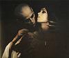
In terms of narrative, this is one hell of a dilapidated ride, which may just be the point if you're reading Grant Morrison (who by the way, I still think is more nuts than Batman himself), but it's Dave McKean's artwork that really makes this graphic novel absolutely brilliant to me. I was captivated purely by the visuals alone, although I'm iffy about the typography, especially the Joker's speech text (maybe only because I strained my eyes trying to decipher it, but to be fair, it suits the context). McKean's unique illustrative style of fragmented framing, gritty collage elements, watercolour/air-brush splatters, high contrasts and frantic linework portray the terrifying darkness and disjointedness that becomes Arkham Asylum.
A very different take on the Batman psyche. You'll either love it or hate it.
A very different take on the Batman psyche. You'll either love it or hate it.

dark
tense
medium-paced
Plot or Character Driven:
Plot
Strong character development:
No
Loveable characters:
No
Diverse cast of characters:
N/A
Flaws of characters a main focus:
N/A

dark
mysterious
sad
medium-paced
Plot or Character Driven:
A mix
Strong character development:
Complicated
Loveable characters:
Complicated
Diverse cast of characters:
Complicated
Flaws of characters a main focus:
Yes

It seems like maybe this story (in terms of theme and artwork) was very different from the Batman stories that existed at the time of its original publication. And that contrast made it special. But at this point, the story and themes don't seem very revolutionary. The dialogue isn't as smooth as I'd have hoped. I also couldn't read some of the dialogue (from Joker especially) because the letter style was so odd. The art in general is that lates-80s/early-90s Vertigo-style artwork that I hate so much. So double thumbs for me. At some (many) points, I just wasn't sure what I was looking at. If you ask me, that's reason enough to dislike a comic book.
BUT
There is one saving grace. In the 25th anniversary edition, there script is included after the regular comic book. In the script, you get to really see all of the ideas that Morrison was playing around with, because he explicitly states all of the allusions he is making.
Perhaps I'm just not good enough at reading comic books, but I wouldn't have known about the depth he was trying to add into the story, if not for the entire script being in the back. The script also reads more like it's written for a movie. It's not a traditional page-by-page comic book script. If you had just told me to read this script instead of the actual comic book, I would have come away with a better opinion if this story.
Wow. Also, wow. Tour de force. It's not my Batman. But it is a brilliant Batman. A dark, impotent, infantile Batman who does battle with monsters and becomes monstrous.
This comic shares first place of best comic of all time, along with Killing Joke. Some stories are meant to be told along with great art. It wouldn't have been the same told in any other way.
The art is stunning, but there are parts that are difficult to read because the font is hard to see against the images. However, it's still a wonderful story and amazing graphic novel.
not the best batman comic obv but i absolutely loved the illustrations !!!!!! they’re so creepy and eccentric and honestly i was a lil scared of the joker for once
challenging
dark
emotional
mysterious
reflective
sad
fast-paced
Plot or Character Driven:
Character
Strong character development:
No
Loveable characters:
No
Diverse cast of characters:
Complicated
Flaws of characters a main focus:
Yes
Voto basso per la grafica, davvero da mal di testa.
Assolutamente sbagliato il font e il colore usato per far parlare Joker.
Lo sforzo necessario per leggere il font complesso e capire i disegni distrae dalla storia,
che, solo dopo la rilettura, si può definire interessante e "nuova", perlomeno per quel periodo.
In ogni caso, neanche lontanamente paragonabile alla qualità di "The Killing Joke" di Alan Moore che si trova lassù, nell'Olimpo dei miglior comics mai scritti.