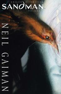
Take a photo of a barcode or cover
4.55 AVERAGE
4.55 AVERAGE
adventurous
challenging
dark
lighthearted
mysterious
reflective
I had never picked up a comic book/graphic novel until I discovered there was an eighth season (and now ninth) of Buffy the Vampire Slayer. Unsurprisingly, I discovered I loved this genre I that I had previously left unexplored. I’m still a comic newbie. I’ve read Buffy, some Wonder Woman, Tamara Drewe, and Castle Waiting. Buffy I love. Wonder Woman I like. And the others are okay. I hadn’t found something truly awesome and addicting until I picked up Sandman.
I know. Everyone loves Sandman. I’m not even surprised I love Sandman because I love Neil Gaiman’s other work. He’s one of my favorite authors and Neverwhere and Anansi Boys are two of my favorite books. Still, I was worried Sandman would be too dark and intense for me. (As was American Gods.) Not so. Apparently, I have a fairly high threshold for darkness. Who knew?
Let’s see…my favorite characters so far are Rose, Death, Fiddler’s Green, and the Sandman himself. I’m not really annoyed by anyone yet, but, of course, since I’m not well versed in comics, I’m often confused by the fact that I’m supposed to know who some of these characters are and yet have no clue. Still, at least, I get most of the literary references. Score one for the English Major!
My favorite issues were “Tales in the Sand,” “Men of Good Fortune,” and “Lost Hearts.” I particularly enjoyed the Rose-centric issues and Death’s excursions weren’t too bad either. There were no stories that I hated, but there were some I found less than enthralling. “A Dream of a Thousand Cats” some how managed to be both boring and amusing, and as much as I love William Shakespeare, I found “A Midsummer Night’s Dream” to be taxing. I hoping Dream will spend less time on earth in the next volume and more time in other realms. I’d like to see what else these strange worlds have to offer (and what other weird characters reside in them). Earth’s not bad. It’s just that there’s so much else I’d like to see.
I finished Volume One of The Absolute Sandman in a couple of days. It was like watching a highly addictive television show. I loved it and already have Volume Two out on standby. Oh dear, I guess I know what I’ll be doing this unseasonably cold Spring week.

I love the Absolute editions. I thought the size might be too large, but it really is nice to read, and let's me focus on the art as much as the words. And I love the recolors.

While I agree with this article that the coloring in Sandman needed to be touched-up for this definitive edition, I was very disappointed at the direction they decided to go with it. You can see from the various examples in the article that in every case, they have replaced the bright, otherworldly colors with bland, murky photoshop blends.
It's very disappointing to see a book which had such remarkable, experimental art reduced to such generic choices. In every instance where a face was colored in lurid, expressionist shades, we instead get a jolly, normal pink tone. Originally, the colors took influence from the often fantastical works of European artists like Moebius--refusing to limit their palate and exploring tones, textures, and novel uses of lighting to set the mood.
But then, the prequel to Moebius' own series, L'Incal was similarly butchered by muddy, dodge-and-burn photoshoppery that completely obliterated the bright, wondrous colors of the French version. In this new Sandman, they even take the very stones of hell and change them from bright, fiery red to a desaturated mauve--who knew demons were so fond of light pastels?
Certainly, the inks needed to be darkened, but if the colors needed anything, it was to be brightened, not submerged. If we were republishing Action Comics #1, would we want to switch from four-color action to realism? Should Las Vegas' iconic googy sign be redone in modern tones? Would Munch's 'Scream' look better in naturalistic flesh tones? Why, then, obliterate the very style that made Sandman stand out?
I know that the DC of Alan Moore, Neal Gaiman, and Peter Milligan is gone now. These new Vertigo books are just young folks trying to copy what came before, and Vertigo, once an experimental art house for new creators, has become a blandly profitable branch of the company which produces safe, familiar books. So I shouldn't be surprised at the sad treatment of this great series--they want to make it more palatable in order to sell more books. Yet it sticks in my craw that this 'Absolute' edition, supposed to provide the highest quality, most authentic version of Sandman falls short of the mark set by the original.
2010
Absolutely fantastic
2021
Eleven years later I am rereading, and it's just as lovely as before. The oversized heft of it and the care in the bindings, embossings, endpapers, notes. The extras are fantastic, especially the full script of Midsummer's Night Dream laid out alongside Charles Vess's initial rough drawings. I saved up my Amazon credits for a full year and bought the complete (for now) set of five Absolute Sandman's (Sandmen?) ... looking forward to the journey.
dark
mysterious
reflective
relaxing
tense
medium-paced
Plot or Character Driven:
Character
Strong character development:
Complicated
Loveable characters:
Complicated
Diverse cast of characters:
Yes
Flaws of characters a main focus:
Complicated
A collection of the first three volumes of the series. The first volume I reviewed previously (4/5)
The second volume is my favorite so far. We see Morpheus from the perspective of others and that elevates him as a character, the way he is perceived by others and by different cultures makes his mythology even more epic. In future chapters I hope the focus goes back to Morpheus himself because as to others he may appear as if he knows everything there is, with grace and nonchalantness, but to himself he is scared, often confused and there is much for him to be learned. (5/5)
The third volume is mostly consistent of many short stories, many of them are great reflective epics (Shakespeare’s chapter) and many of them are incredibly eerie, making me scared even days after reading them (the cat’s dream chapter). Overall a great chapter and is a good breather for the end of this collection. (4/5)

adventurous
dark
mysterious
medium-paced
Plot or Character Driven:
Plot
Strong character development:
Complicated
Loveable characters:
Complicated
Diverse cast of characters:
Complicated
Flaws of characters a main focus:
Yes
While I was too young to have read this series when it first came out I'm glad I've read it now. Its just great storytelling.
Beginning to read his works last month I'm already infected by the Neil Gaiman virus. So why not read my first ever comic series written by such an amazing author?
Unfortunately the local public library only owns the Sandman series in German which is the main reason for my not-so-great rating. Whoever translated this decided to go literally from English to German. Aside of this sounding a little weird it leads to the whole conversations being grammatically wrong because we use another tense to talk about something in the past. This was really annoying to me and ruined this comic a little to me. I hope it gets better in the following volumes.
In terms of story and characters it was a little hard to get used to everything. The setting and the vibes of this comic are something very new to me, the story was surprisingly violent and the drawings graphic. I kind of enjoyed it but continously had an uncomfortable feeling. Probably Neil Gaiman is right saying in the epilogue that the first volume shows the process of finding his own style and that everything comes together in the later comics.

Notes on my re-read. First read through I was in my teens.
I remembered not caring very much for the first trade. This time I was much more engaged and searching for details in the first few issues because I know where it will go. (Like our first meeting with Nada!) I love Sam Keith, but I still don't love his doughy faced fae-like Dream. When I picture Dream in my mind it is Mike Dringenberg's version.
During this read (older and more patient, or because of the oversize format?) I was in awe at Sam Keith's beautiful panel design and layouts.
My opinion on the recoloring. Holy overkill. I understand that some colors could be adjusted that were hiding line art or to separate individuals in groups of creatures, but entire color palette changes makes me sad. ex. Green portal is now blue. I miss the electric blues of 80s and 90s comics. Extreme overuse of the ombre looking color fading transitions (not sure what this is called in comics)makes this book feel post 2000. The hyper smoothness of the transitions feel digital. Does not compliment the sketchy, artist's pen is giving out but making cool textures, areas.