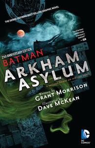
Take a photo of a barcode or cover
Love the art style but the story and words on the page were awful. When I could read them. Legibility wasn’t an objective for the inkers here.
Oh gosh. People need to chill about this not capturing the true Batman or being impossible to follow or pretentious or whatever else.
I enjoyed this for its strangeness and darkness and early Dave McKean artwork. I read the updated edition and my understanding is the Joker lettering is illegible in the original. So this is a good update with some fun extras and cleaned up artwork.
And who wouldn’t want to read pages of rants about occult and Christian imagery contained in Grant Morrison’s script? You wouldn’t? Well I would and I mostly enjoyed the strange tangents, tarot lessons, and occasional film review included.
fast-paced
Having stepped away to gain some perspective and reading the author's final draft and comments at the end truly make me realize what an accomplished feat of genius and craftsmanship this graphic novel is, besides my initial appreciation for the art but confusion at the mystical setting. Essentially re-reading, I can tell that this story requires multiple readings to understand it's complexity and while I understand how I read mysticism (and the ink scratch drawings of many pages and characters) as reminiscent of 80's Constantine stories, I am more fully in tune with Morrison's intended themes and story and it does feel like a true Batman story, if perhaps the Batman of another earth. This Batman is the darkest parts of Bruce and his Batman figure the way The Dark Knight is the efficient and brutal side of him. I actually applaud the exclusion of Robin in this (though its funny that the exclusion came about because he was too campy(?) for McKean) because the Robins are representative of Bruce's nurturing side, directly in conflict with the image of a repressed and psychologically scarred man presented here. At the same time, Morrison's twisted use of Robin in Joker's dialogue is intriguing.
I will say I'm glad the campy Rocky Horror type transvestism theme for the Joker was overruled. It feels both unnecessary and disgustingly transphobic, reading it now. It's also too stereotypical (using gender reversal as a depiction of a villain). The language used but combined with the more traditional look of the Joker (if more creepy based on the artistic styling) does feel like the best choice.
Basically, especially reading the authors notes, I am in awe of the layers of detail, knowledge, craft, and intelligence used to create this book. I think one could read it 10 times and still learn or connect something new on the 11th.
I also enjoyed learning the connections with Neil Gaiman - somehow things seem to make more sense knowing that. I now desperately need to pay attention to McKean's Coraline and The Graveyard Book art, even if it's not as transformative as the art in Arkham.
dark
mysterious
after reading the original pitch script thingie at the back, i kinda wish they’d chosen a different artist… which is crazy bc i love Dave’s art! but i’d say almost half the time it’s a little too dreamy and ambiguous. it kind of makes it less scary and hard to even tell what’s going on. the part with Maxie Zeus is an especially sad example of this - the description Morrison gives is SO much better than the blurry blue mess that we got. BUT other times, like with Arkham finding his murdered family, Dave’s art style fits PERFECTLY & elevates the whole thing. idk. i kinda want to see this reimagined with another artist… is that like, horrible? anywho great writer great artist so still a 4 even though i do think some of the scenes were mid compared to the full script.
I can see why some love this, but it was only okay for me. The art is love or hate it, but everything seems like it's trying to make a very unclear point about Batman.
Certainly one of the edgier Batman graphic novels, the art is the only reason this gets as many stars as it does. Morrison's story is ephemeral and incoherent at times - McKean's artwork is the real storyteller here.
2.5/5stars
Okay, I didn't love this. I might revisit it later on after reading some other Batman graphic novels and stories, because this was probably not the best place to start on Batman - but I was forced to read it for my postmodernism class.
This was simply VERY confusing and filled with metaphors I didn't really understand since I hadn't read any other Batman stories (yet.) The art style made things VERY hard to physically see (such as Joker's dialogue) as well as very hard to follow and figure out what was happening. The story was also quite hard to follow, and I just had a LOT of questions while I was reading it.
It was entertaining when I knew what was happening though.
I can honestly say I’ve never seen a comic like this. The art is painted (!!!!) and so so so creepy. I realized way too late into this that this was a huge inspiration for the Batman: Arkham Asylum video game. This’ll keep me up at night for sure.


