You need to sign in or sign up before continuing.
Take a photo of a barcode or cover
3.97 AVERAGE
3.97 AVERAGE
Received this through netgalley.
This was my first time ever reading Jane Eyre. And I really enjoyed it. The drawings was so beautiful and I really enjoyed the storyline. I loved that Jane was so Independent and didn’t take crap from no one.
“I am no bird; and no net ensnares me; I am a free human being with an Independent will” - Jane Eyre.
My first graphic novel! - never really had the desire to read a graphic novel. Then I saw this classic story presented in this format and decided to give it a try. Although I prefer the original novel, it was fun to read and quite accurate. I think I will try another Manga Classic! You should too!
emotional
inspiring
fast-paced
Plot or Character Driven:
Character
Strong character development:
Yes
Loveable characters:
Yes
Diverse cast of characters:
No

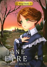
Having thoroughly enjoyed reading the Manga version of Pride and Prejudice by Jane Austen, I decided to pick up another favourite classic, Jane Eyre by Charlotte Bronte. The original is a substantial novel and the first third of the book, before reaching Mr Rochester, has always been a challenge. Jane’s start in life is bleak and sad. The manga version, with its magnificent illustrations, shortens this journey whilst still communicating the emotion of it which I appreciated. The time with Mr Rochester is elegantly done, the familiar lines included and the romance accentuated by the accompanying visuals. The style of writing can put some readers off this great story, I think the Manga version overcomes this barrier and will encourage new readers to appreciate Bronte’s work. I love art and this is definately a form of it! I have my eye on Emma as my next Manga classic, a five on the en-JOY-ment scale!
http://moonglotexas.com/2017/07/09/book-review-manga-classics-jane-eyre-by-charlotte-bronte/
http://moonglotexas.com/2017/07/09/book-review-manga-classics-jane-eyre-by-charlotte-bronte/
I love manga so when I saw manga classics on NetGalley I KNEW I had to read them all!!
The story is wonderfully imagined with the beautiful manga illustrations and is a joy to read. I really, really need a physical copy of all of these.
I can't say much more than I LOVE these editions. That is all that needs to be said.
*Huge thanks to Charlotte Bronte (obvs), Stacy King, SunNeko Lee, Crystal S. Chan and NetGalley for this copy in exchange for an honest review*

adventurous
emotional
mysterious
reflective
sad
medium-paced
Plot or Character Driven:
A mix
Strong character development:
Yes
Loveable characters:
Yes
Diverse cast of characters:
No
Flaws of characters a main focus:
Yes
My first manga! I decided to choose a story that I knew so that I could figure out how to follow the text on the page. I LOVED this version of Jane Eyre. The artwork was gorgeous and the text remained true to the story.
I read a library copy but I will be buying my own!
I read a library copy but I will be buying my own!
Jane Eyre is one of my favourite books and I was interested to see what a manga version of it was like. I read comic books on occasion, but have not read much manga. I am unaccustomed to reading right to left, but found that within a couple of pages I didn’t need to think about it.
The story telling was great, and the adaption has been done deftly enough that there are no noticeable gaps. The characters are true to the original and the feel of the story is right. The illustration adds to the emotional feel of the story. For myself this was a great way to re-experience a much loved story in just an evening. I think it would also serve as a good introduction for those unfamiliar with Jane Eyre.
I also loved the end notes explaining the thought that went into the adaptation, they gave it much more depth and revealed the thought and work involved in the process.
Overall, I enjoyed this and will be looking for other books in the series as I believe they have done other classic novels as well.
I received an electronic version of this book for an honest review from the publisher via NetGalley. This has not coloured my opinion of the book.